How can we re-design DBS’s premium investment banking app to better serve business & user needs?
I led and executed a year-long, end-to-end design overhaul of digiBank (Wealth) – DBS’s premium banking and investment app for high-net-worth individuals.
The redesign enabled faster on-the-go trade executions, empowered more informed decision-making, and introduced adaptable portfolio & investment design patterns that were scalable to future needs.
My contribution:
UX Lead, working with 1 designer to execute the redesign over 11 months with the business unit team, design system team, delivery team, and multiple dev squads in Singapore and Bangalore
Oversaw the design of all 16 investment features and 50+ user flows
Led design presentations to senior stakeholders at key project milestones
Defined outcomes, charted design roadmap and project timelines
Drove alignment and collaboration with business, delivery, tech across multiple agile squads in Singapore and Bangalore
Created new design system components for data heavy investment and portfolio flows, expanding design library to handle wider variety of complex financial data

Bank-wide tech & design overhaul
The DBS digital team undertook a major initiative in 2019 to overhaul the tech stack (from Kony to Native) and unify the design of its 7 banking apps across 5 markets (Singapore, Taiwan, Hong Kong, India, Indonesia).

I was tasked to lead the design effort for Singapore’s digiBank (Wealth) app with a tight 1-year timeline to launch.
Off the bat, there were already a series of usability issues that needed to be addressed but couldn’t due to different priorities for the tech and business teams. This was design’s chance to take advantage of this overhaul.
Establishing success criteria & desired outcomes

Together with the business team, we compiled and clustered known user issues and feedback on the existing app.
I initiated 1:1 chats with 2 key senior stakeholders to gather their views on what they felt was needed for the next generation Wealth app.

We aligned with the various business teams and senior stakeholders on 6 key outcomes to measure the design revamp effort against.
This anchored the wide scope early on and provided an objective set of shared goals that guard-railed meetings with the other teams and stakeholders down the road.
It was a step forward, as previously there was little alignment on objective outcomes between design and business, leading to a lot of subjective and opinionated mandates that were detrimental to the overall user experience.
Charting roadmap and feature prioritisation

Towards the beginning of the project, together with the business team, we mapped out all the features on iWealth and did a first draft priority based on the design complexity and amount of alignment needed by the various departments of the bank.
As the management decision was not to launch a partial revamp, all 16 features and 50+ flows had to be pushed into production before we could launch.

Different tech squads were focused on different features, working in a somewhat independent manner from each other.
Being the design lead, I worked with the squads on the prioritisation of features and moved parts according to the squads available for development.
Test early, fail fast
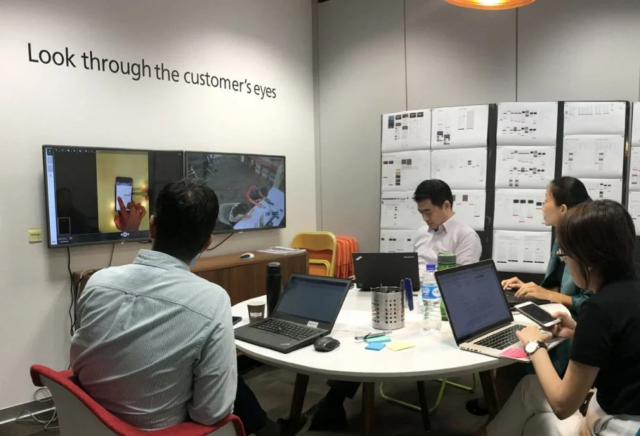

Working closely with the UX research team, we tested design concepts for the Invest tab and portfolio view early on, within the first month of the project. The business team also sat in these sessions.
This not only revealed gaps and opportunities to iterate on very early on, but also created a tight alignment between users, design, and business that accelerated the process forward.

Some critical learnings that guided the eventual designs:
The existing navigation was not intuitive for users, which made value-added monitoring features like Watchlist and Favourites hidden
Labels and categorisation using bank vernacular were confusing (e.g. invest portfolio vs investments, asset class vs asset type)
Lack of clear affordances for what was interactive and non-interactive (e.g. category tags for funds, sub-menu selections for things like Rollover Instructions or Order Type)
A dedicated home for investing
The app had an overly complicated navigation model that trapped users within layers of menu navigation, keeping key information and tasks hidden from view.
This created a disjointed user experience where related tasks like searching for an equity and equity insights were housed in separate menu categories and task flows.
Working closely with the business team, we went through each flow, from portfolio management to trade execution, rethinking user journeys with the business team and restructuring the information architecture and navigation model accordingly.
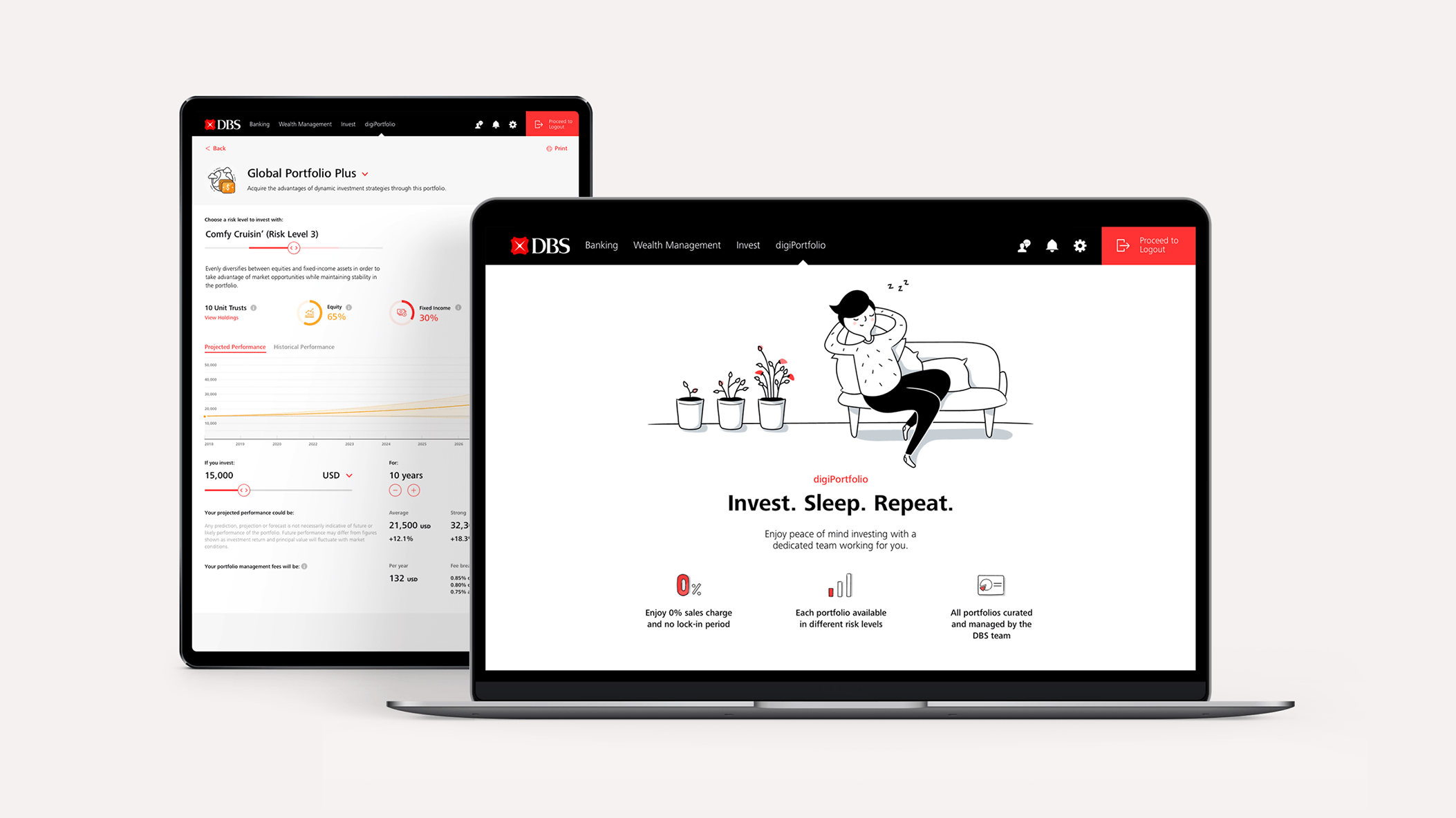
Evolution of the Invest page design
For the Invest tab, we eventually landed on an interaction model of a launchpad to the wide variety of investment product offerings. It could also scale up or down to respond to future business needs, catering to both the self-directed and advice seeking personas.

With this new model, distinct homes for each investment product could also be established, consolidating all the related features into a more centralised place to facilitate a more streamlined investment experience.
These homes could be scaled by the product teams to fit their future needs without breaking the overall design and navigation of the app – a frequent problem the previous design ran into.

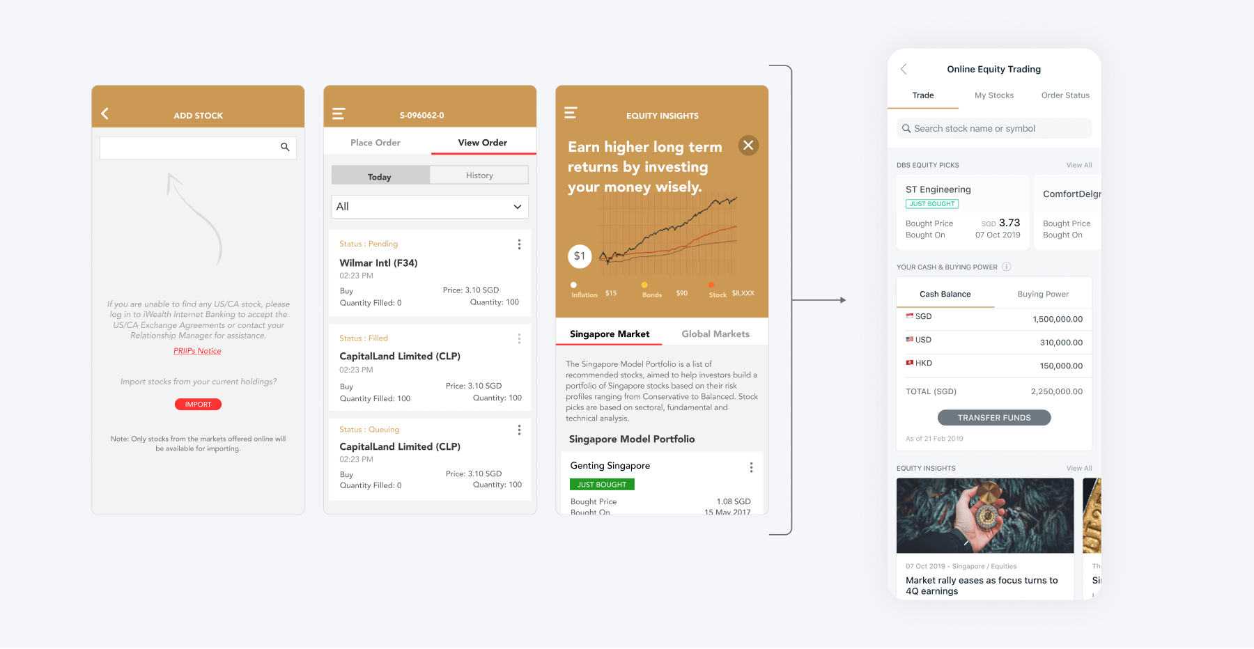
Consolidating separate screens + flows into a scalable product home
A more organised portfolio view

The portfolio view was redesigned to presented a clearer interaction model, with the main tab navigation used solely for different presentations of the portfolio holdings.
Other secondary actions like eAdvice and Transaction History were housed in the quick action bar and not mixed with the tab navigation.

A visual system using icons and colour codes was also established to better distinguish between asset types and improve the presentation and organisation of portfolio assets.
To support the dev build with this large scale of changes, each data point was referenced to its BAU location, facilitating a smoother and more efficient hand-off.

Quicker decisions and faster trades

Holding details and supporting information like price movement, cost price, and even buy/sell CTAs were previously on separate pages, accessed through a modal menu. This made it difficult and frustrating to piece together related information needed for an investment decision.

I revamped the holding details page and consolidated all the relevant data into a single page. This allowed users to see all the useful information together in one place, helping them make better decisions within the context of where the decisive action can be made.
Critical actions like buy/sell were persistent at the bottom of the screen, with supporting actions like price alerts and watchlist were housed in a scalable quick action bar up top.


The trade execution flow itself was also simplified by nesting the relevant order durations under the order type, revealing the relevant options based on the order type selected.
In the original flow, a lot of back and forth navigation was needed to set parameters like the order type and order duration. Especially as the order duration options were different depending on the order type.
Users can now make all their selections within a single step. Contextual info like the duration of ‘Good Till Max’ was also added to further guide the users.

Project impact

Ranked #1 Mobile App for Wealth Management (2020) by Cutter Associates Wealth and Wealth Management Platform of the Year (2020) by Asian Banking & Finance
Shipped a full-feature, revamped app within a tight 11-month window through systematic execution of design flows and collaborative relationship with the dev squads
3x reduction of steps needed to execute trades through simplified navigation, task consolidation, and holistic data views
Pushed through 3 hard-stance agenda items with senior stakeholders to enhance user-centricity of app
E.g. Renaming bank vernacular like Asset Class into more intuitive terms like CIO Model Portfolio
Design scaled to accommodate future business needs – the base design still used today, more than 4 years on