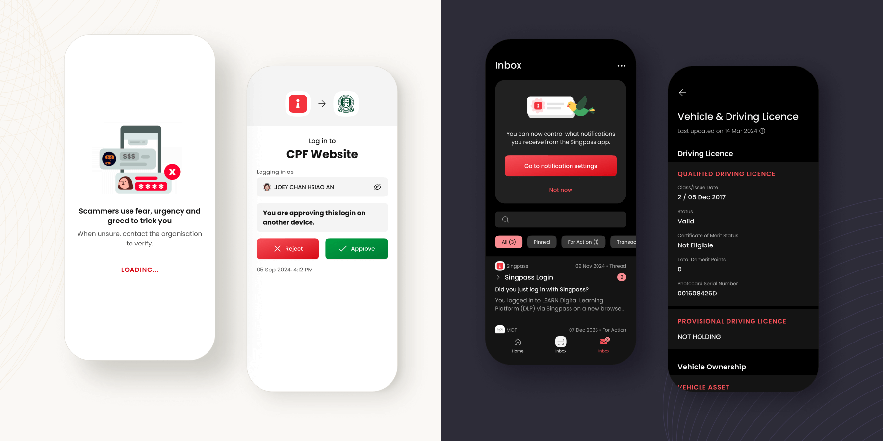
How might we steer Singapore’s digital identity amidst rising scams, new technologies, and evolving expectations?
Singpass is the Singapore government’s official service used by 4.1 million citizens & residents monthly for authentication, logins, and data sharing across public and private sector services.
In my three years with the Singpass Division, I led 12 design initiatives with the App team’s PM and 10+ Engineers (iOS, Android, backend), within a division of 100+ people, 5 designers, and 11 teams.
My contribution:
Design lead, delivering Singpass app related design features over 3 years, including revamps to the Login, Onboarding, Inbox, and Settings flows
Led design thinking & alignment sessions with stakeholders, designers, and teams across the division
Worked with PM to define product vision, design roadmap, next-gen concepts, and delivery timelines
Organised & conducted user research that resulted in actionable insights to drive product outcomes
Collaborated with mobile engineers to tackle technical design-related issues, as well as accessibility and security features
Instilled best practices & standards of design quality for 5 designers and 1 UX researcher across the division
Delivering impact on a mature government product
Our team’s product mission was to maximise user value and ease of use, with tactical goals to increase reliability, strengthen security, reduce cost, and enhance customer experience.
The challenge was steering the design vision of where the Singpass app needed to be amidst bandwidth-consuming requests and mandates from internal and external teams (some of which were also national level priorities).
Instead of big bang pushes, I found success in driving smaller, incremental tracks, working alongside other teams and functions with a long game view towards mutually beneficial outcomes.
The 12 design tracks I led, during my 3 years on the Singpass App team
The sum of these tracks moved the needle on the overall app experience – improving user security and accessibility, simplifying engineering implementations, and enabling robust scalability of new features and technology.
Steering top-down directives towards user-centered outcomes
– Improving the QR login journey
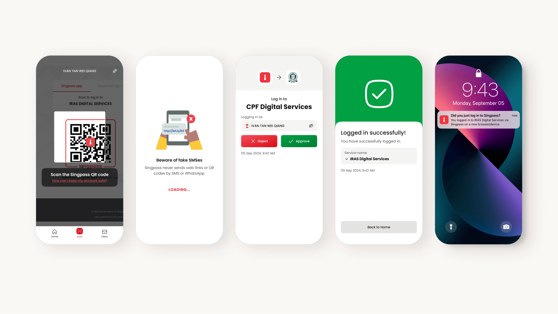
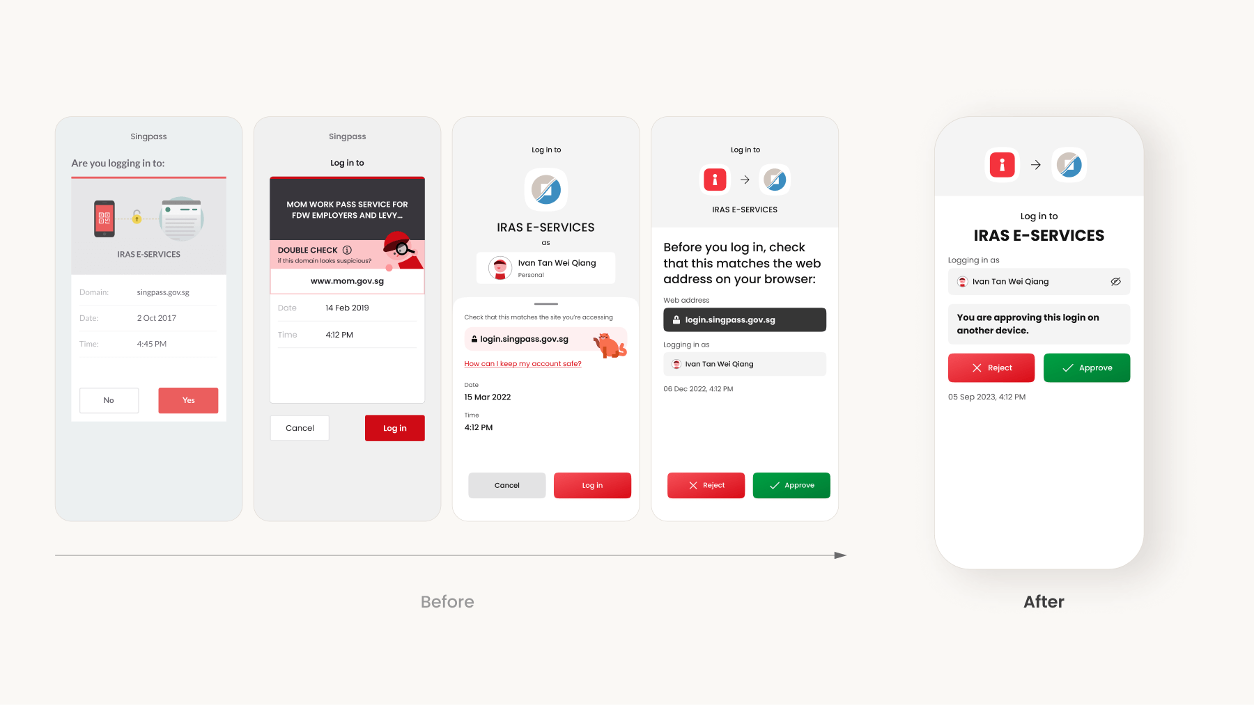
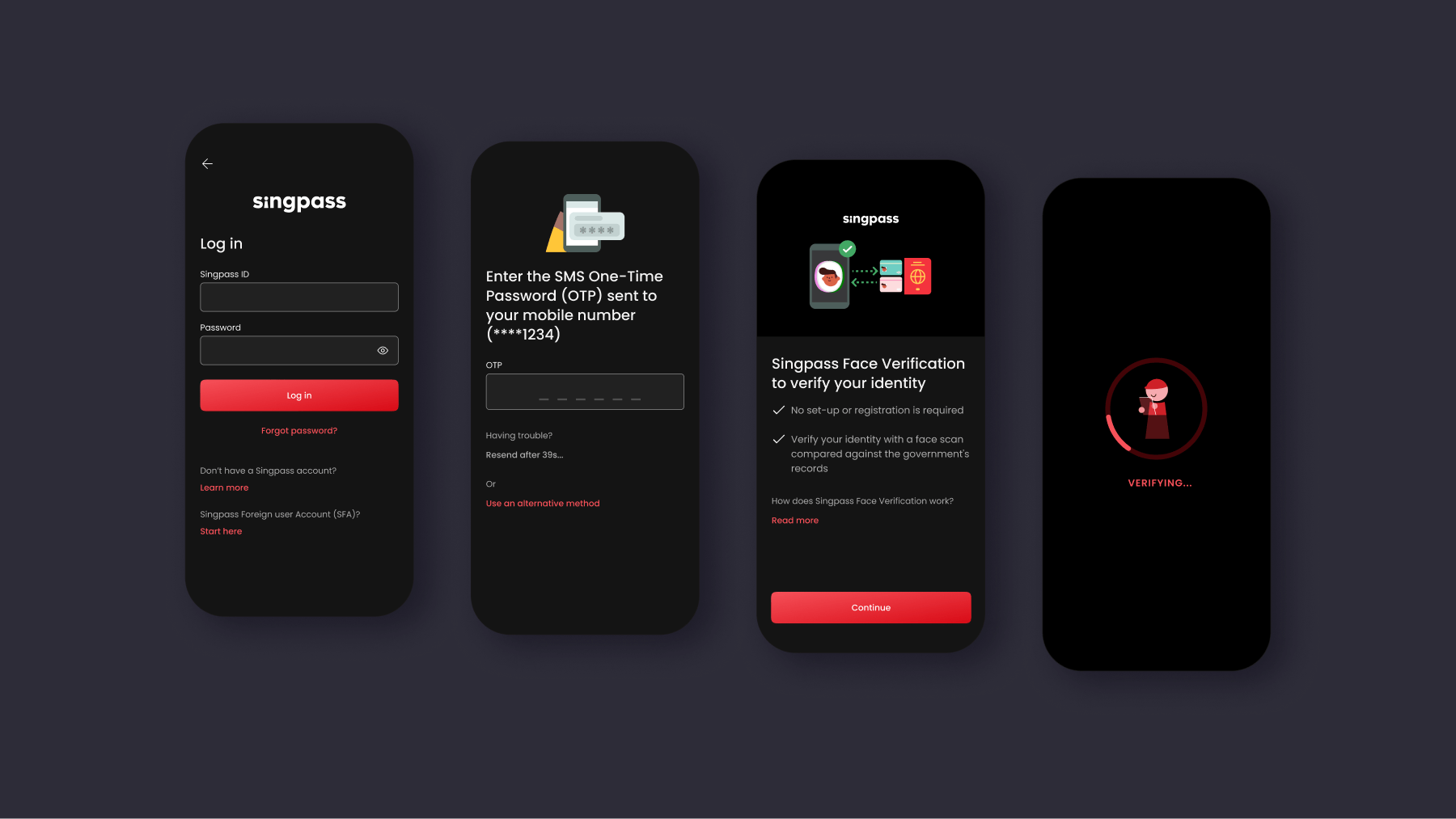
With a significant increase in scams targeting Singpass app logins (often through social engineering and QRL jacking), the login consent screen became a topic of discussion across the organisation.
Metaphorically it was the master key to essential banking and government services, and there were directives to fill that screen with large warnings and messages.
Identifying stakeholders’ tunnel focus on a single screen, I led the conversation zooming out to the larger context, mapping the login journey into 5 phases.
Each phase had different jobs-to-be-done and we identified how we could approach the problem holistically through relevant touchpoints in each phase.
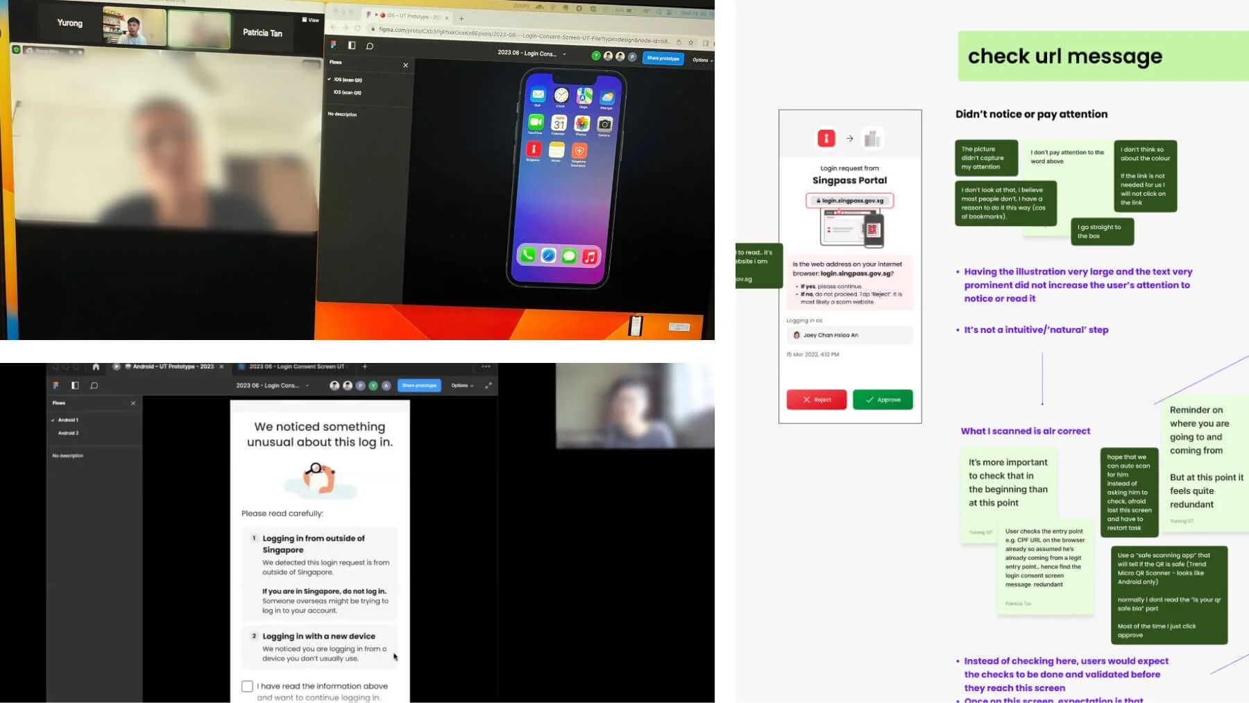
Leading and conducting qualitative research
– conducting it over Zoom enabled higher participation from working adults
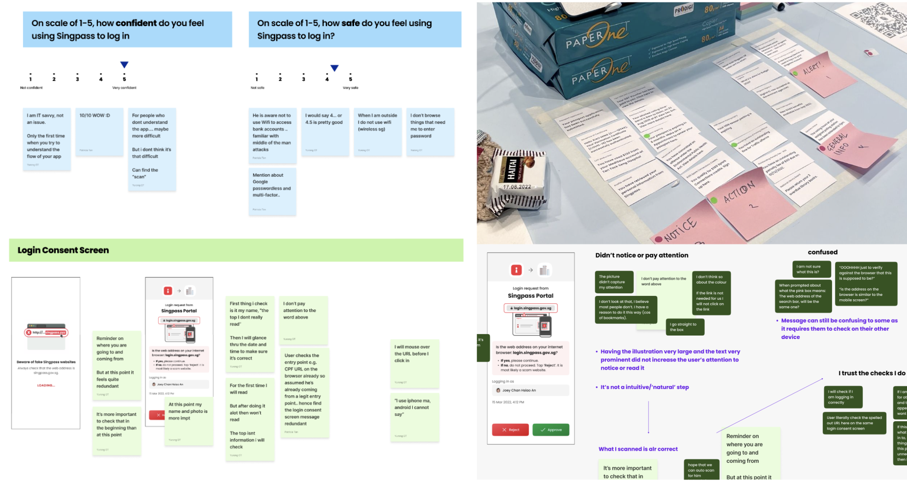
Synthesising findings, mapping insights
– we learnt that users have high trust in government products, leading to lax behaviours when using Singpass
I conducted user studies, testing out various consent screen designs and revealing how users are in a state of hyper focus during log ins, often not even noticing the drastic changes we made to the consent screen, with their attention taken up by the CTA buttons.
The research studies also uncovered mental models and expectations of users through the different phases of the login journey, enabling us to drive other user-centred solutions to holistically and effectively achieve the overall outcomes of better security safeguards.
This drove a cleaner, simplified login consent screen displaying only critical data points (opposite to the initial directives). Supporting information was shown either before or after logging in, when users are in a clearer state of mind and more alert to abnormalities.
5 other enhancements were executed across the login journey, improving the overall design towards a more security focused log in experience.
Charting the design strategy + aligning roadmaps
– Singpass App Design Strategy
In mid-2024, I initiated a relook into Singpass app’s design strategy, working with the PM to create a prioritisation framework to better manage ad hoc requests and allow us to focus on more strategic user experience initiatives.
Snapshot of design thinking and alignment sessions
– we aligned on roadmaps & priorities, crucial as many features are co-dependent between teams
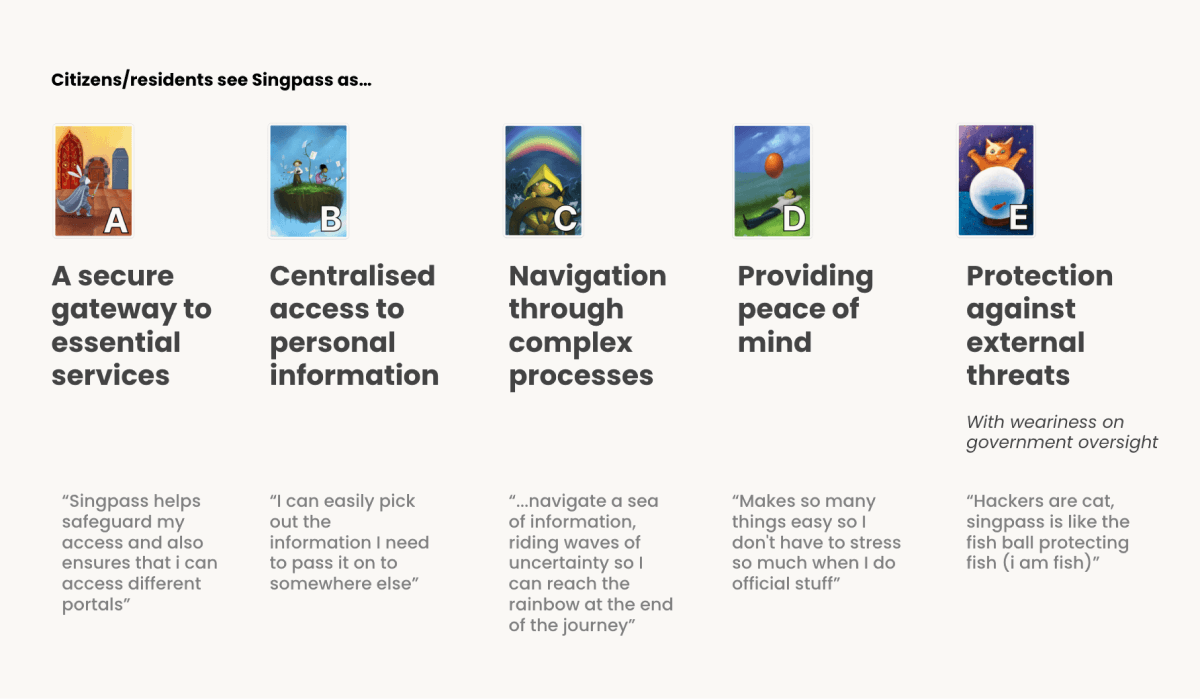
Leading a series of design thinking sessions with 6 cross-functional teams, we internally defined what user value and ease of use meant, aligning shared outcomes and feature roadmaps between interdependent teams like CX, Transact, Anti-Fraud, and Public Comms.
L: web form sent to 600 users, R: one of our consolidated findings
These outcomes were further validated through a quantitative study with 600 users, uncovering insights like the greatest joys and biggest worries with using Singpass, driving user-validated decisions of which features to push for the coming year.
Leveraging in-flight work streams to drive UX initiatives
– App onboarding redesign
The onboarding flow was plagued with usability issues and poor design that made it confusing for users, affecting onboarding success rates. Simple tasks like resetting passwords became the top Helpdesk ticket.
This rippled into negative operational, economic, societal impact with affected users being unable to access essential government services. Various technical and internal constraints meant we could not push new design changes, let alone redesign the flow.
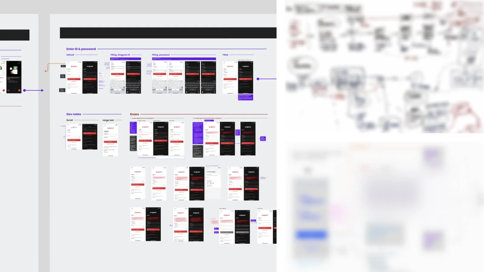
Working with engineers from App, Auth, Portal teams to map out tech flows and align on implementation
– removing the initial blocker caused by different understanding between teams
A separate workstream eventually surfaced, with the Auth team tasked to build a new Multi-Factor Authentication (MFA) framework. One implication was the app onboarding flow had to move from web-view to natively hosted.
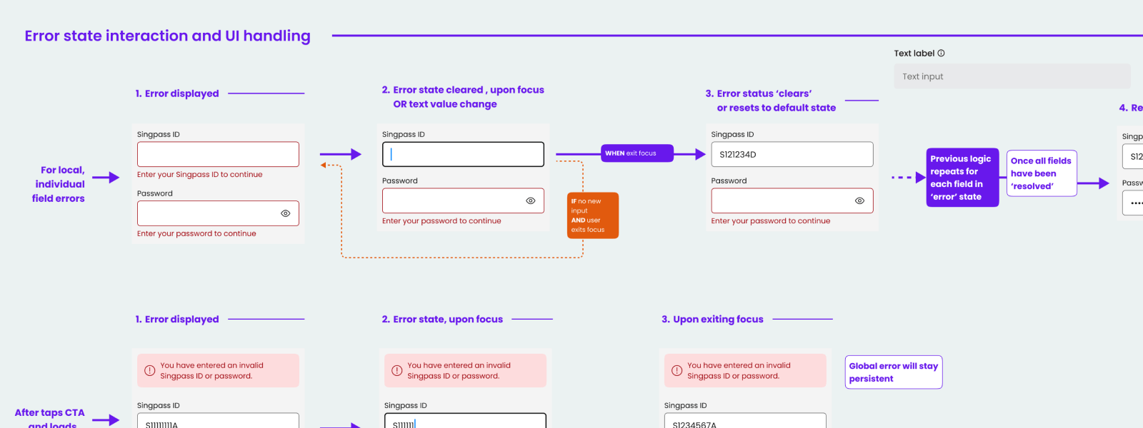
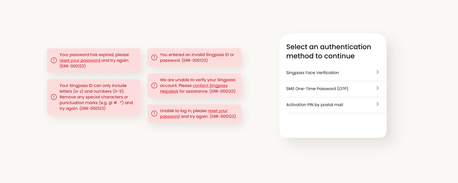
Leveraging this opportunity, I worked with the App engineers to not only introduce a more intuitive and accessible design, but also collaborate with CX to design better error flows that reduced Helpdesk load.
Under a tight timeline, I delivered a holistic design revamp of the app’s onboarding flows in just 3 weeks, introducing scalable design patterns with improved error handling and alternative methods of authentication should users get stuck.
Design practice impact
– Design leadership examples
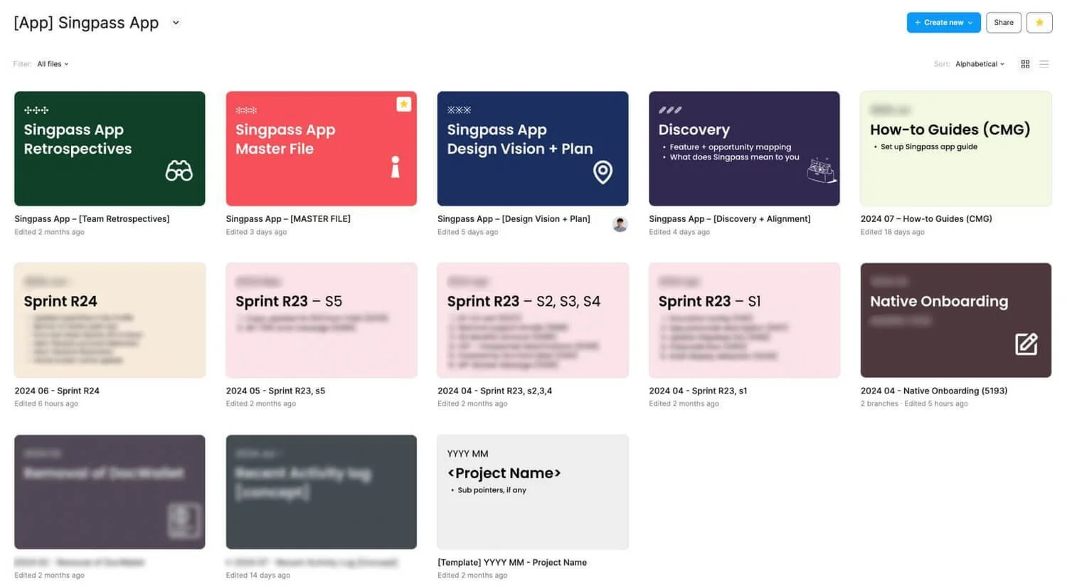
When I first joined the team, the 5 designers were siloed across the division and design efforts were dispersed. Figma files had different structures and layouts, making it difficult to find relevant screens, affecting the overall quality and impact of design.
Streamlining design-to-build workflows
I standardised the Figma file layouts and naming conventions and established Masterfiles as central sources of truth.
This organised structure made collaboration and design-to-build workflows much more efficient, allowing PMs, engineers, and other teams to self-serve and prevent confusion over designs.
Increasing visibility & fostering design collaboration
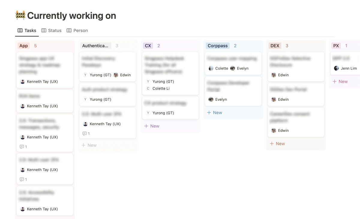
Noticing a need for more visibility on design tracks among PMs and designers, I created a Notion workspace for designers in the division to foster sharing and open collaboration.
I set up sections like design task cards, case study templates, resource listings, and design team calendars. It led to more cross-team learning and consistent designs.
Managing a mid-career intern
I also had the privilege of managing a mid-career intern. Through the various design tasks, I taught things like Figma skills, developing design directions, creating illustrations, and giving her opportunities to present to the wider team.
It was a rewarding experience which helped me discover an aptitude for mentoring and nurturing the next generation of designers – something I look forward to doing more of!
Pushing & rasing design standards
During my 3 years, I made it a point to explore new prototyping tools to allow us to have more realistic interactions during our user studies. For example, I learnt to use Protopie – allowing us to prototype interactions like scanning a QR code using the phone’s camera and having it react to the QR code.
I taught and shared knowledge on basic motion design principles like easing, and using After Effects to create smooth animations that we could export into .json Lottie files. Previously there was no knowledge on how to use these tools on the team.
Leveraging my design education and consultancy experience, I led user research studies and synthesis exercises, while giving opportunities for the team to also gain mileage in user interviews.
I introduced the UX Researcher (who was a mid-career switcher) on various techniques and exercises like tree testing and card sorting, and creating a note taking template on FigJam to increase the efficiency of note taking and synthesising raw user inputs.
The privilege of designing for public good
– Parting reflections
One thing I enjoyed most being on the Singpass team was connecting with people on the ground – service counter staff, visually impaired, seniors, and everyday citizens.
I not only learnt about their issues, but as the design lead of Singpass app I had the agency to address them in the design. I also learnt how a seemingly simple design change can have significant implications (positive and negative) downstream.
It matured me as a designer, teaching me the importance of developing an understanding and appreciation of the wider ecosystems our products operate in and affect.


