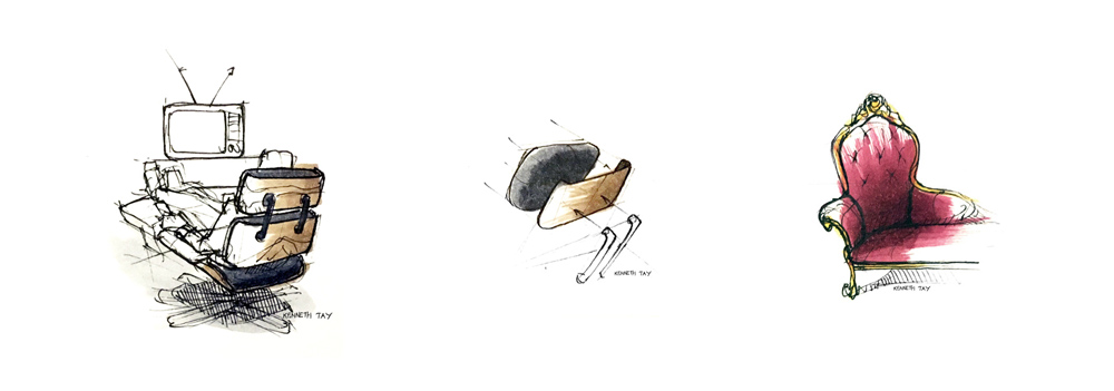
Soul Searching Pt. 3 – My Superhero Alter Ego

Continuing along the thread of graduation, we were asked a few weeks back in our Design Professional class to sketch out our designer alter ego, someone with superhero powers that represented our strengths as a designer.

Alter-Ego_web.jpg

I saw my alter ego as this character called "The Strategist" (got feedback in class that I should call him "Dr. Strategist"), who has telekinetic powers and superhuman analytical abilities. He has levitational abilities too. 

He uses those abilities to establish order and structure in a world filled with broken, chaotic, and disorganized systems and services. 

While this was done as a fun class exercise, it also helped to put together my personal statement. Here's the final draft of my personal statement that would go up to Art Center's Product Design Grads website.

Hi I'm Kenneth, and I make the complex simple.
Coming from Singapore, I grew up in an environment that was very structured and organized, which at times felt really constricting.
Things changed when I was first introduced to the design process in high school. It empowered me to work within constraints, challenging it, but at the same time respecting it.
I probably didn’t realize it back then, but that also contributed to my moderate (some say borderline severe) obsession with neatness and organization.
This bleeds through to who I am as a designer today, living in a world that is becoming more integrated and seamless, yet also more complex and convoluted to navigate.
I seek to bring organization and clarity back to the user, transforming complicated and frustrating transactions into enjoyable and engaging interactions, making the complex, simple.
 

--

Click here to view the complete series of posts on my graduation.

Soul Searching Pt.2 – The Thrills (and Chills) of Graduating

The second week, we had to do a mind map exploring who we are as a designer. 

Going through the motions of doing the mind map though, I felt I was just using buzz words that sound good, and not something that came from the core of who I am and what I believe in.

click to enlarge

I decided do some generative research with myself, to really find out who I was – a process that is really not as easy as it sounds. Wendee (instructor for the graduating class) was mentioning how when people interview students from Art Center, they already know that everyone works way harder than anyone else, and that everyone has an obsession with perfection. It is a given and is not your unique selling point as a designer. I needed to find my unique voice.


click to enlarge

I started with a napkin sketch, while alone in a cafe at K-Town, mapping out who I was as a person, unique to others. It started out with exploring my personality and then relating it to my professional side.

Some of my other graduating classmates have unique traits like bringing energy into a room, or the ability to question and provoke thought. For me, I learnt that I have an obsession in seeking order and structure with chaos and complexity, to create meaning within ambiguity. Maybe this is it – structure within ambiguity.

---
Read Part 1 of this series here.

Soul Searching – The Thrills (and Chills) of Graduating

I'm graduating in 4 months, and part of Art Center's Product Design curriculum for graduating students is this class called Professional Preparation, led by Wendee Lee and our Department Chair, Karen Hofmann

Kicking things of in the first week's exercise we were tasked to build our personal cairn that reflected our journey as a designer.

Below is the essay that I wrote from that assignment. It's a little long but I guess this is why it's gonna be a process of editing and summarizing over the course of the term. 


More than a philosophy or form of personal expression, I view design as a value-added service, a tool, to help businesses and companies grow to achieve their strategic objectives. This current view of design harks back to what made me first fall in love with design. 


Being born and raised in Singapore, I went through the notoriously rigid and monotonous Singaporean education system, where it was mostly about writing the right answer, scoring well for exams, and keeping your opinion to yourself. It went on like that till I was 15, in my 3rd year of secondary school, where I enrolled myself to an elective class called Design & Technology, a basic shop class teaching skills like woodworking and using power tools. It was there that I was first exposed to the design process. The reiterative and explorative nature of the design process immediately struck a chord with me, as I was challenged to explore a variety of solutions to a problem, and that there was no ‘one right answer’. 


click to enlarge

That experience 10 years ago sparked an interest in me that grew into a passion for using design to solve problems. Fast-forwarding the timeline to today, where experiences such as serving in the Air Force, leading a team of MBAs on a design project while on exchange at INSEAD, as well as an internship with Continuum, has shaped me to understand the powerful and relevant potential that design can have in a corporate and business context.

This is where I want to position myself, to play a role in bridging the gap between business and design, complementing quantitative data & analysis with qualitative research & insights, meeting business targets while delivering products and services that enhance the lives of the people who use them.

My cairn, with the front-facing towered structure, reflects the accumulation of experiences like those, building a strong and solid foundation that shaped my understanding of what design is and how it is applied in the ‘real world’. And now that I am at the top, at the pinnacle of my design education, I have a much clearer perspective of how design relates to myself, as well as the world around me.

What I know is that there is still so much more to learn and so much more experiences to be gained that even though this tower might have reached its completion, another journey waits, as represented by the half-built bridge at the top of the tower.

Talk Review: Steve Krug - Is Usability Taking a Nose Dive?

A week ago, Steve Krug, guru of UX design, visited Art Center to talk about the state of UX and usability design today and whether it has degraded instead of improved over the last few years. Below is a summary of what I caught from the talk, as while as my thoughts on the subject.

He starts off the talk stating poignantly that usability is not about creating desirability and delightful experiences. While those things make something more pleasant to use and is an important aspect of design, usability is more about the actual usage of something. He defines usability as such.

Something is usable if:
- A person of average (or even below average) ability and experience,
- can figure out how to use the thing,
- to accomplish some desired goal,
- without it being more trouble than it's worth.

Cool vs Usable

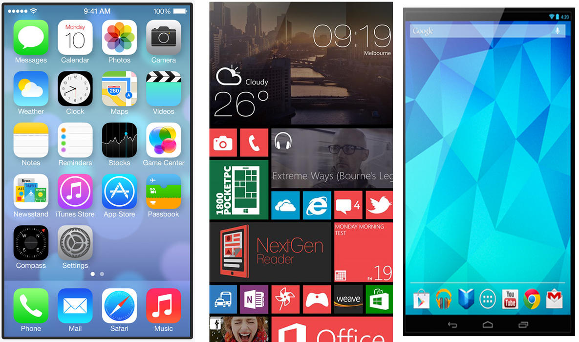
Based on that definition, a lot of modern web browsing features, such as infinite scrolling and centered type on a webpage are notoriously 'un-usable'. In the case of infinite scrolling, it is good for sites like Facebook, where you're browsing through people's status and you don't really care where you end up. But for sites that have rich informational content, like news sites for example, infinite scrolling doesn't make sense as you'll lose your position on the page and it'll be an unnecessary hassle to scroll all the way back up to an article that you want to read again. The Back button on your web browser is also now useless. At this point Steve comically mentioned, "Who would have known that even the Back button – being able to go back to my previous page, would become a problem with today's technology."

As such, it is the designer's responsibility to be able to make that discretion and applying the relevant features for the relevant usage scenarios and not just slap on a feature just because everyone else is doing it and it's the 'cool' thing to do. In fact, in today's context, usability is almost being portrayed as the 'enemy of cool'.


Technology's Fast Pace

One of the challenges for UX designers today is that "things are moving awfully fast." As such, establishing the level of thought and consideration needed to make usable interfaces is an uphill task as the demand for new software is moving a lot faster. It's almost to a point where new devices are coming out faster than new usable interfaces. UX for new technology takes time, a limited commodity in the fast pace of technology.  With the host of usability issues already sprouting up with the introduction of mobile platforms, who knows what will happen next when wearables come onto the scene?

My Takeaways

For me, his presentation was like a wake up call. I realized that I've been having so many gripes with modern interfaces, such as the oversized type on webpages that bleed off the screen. While these look great for the mobile platform, they are horrible to use on a desktop platform. However I was under the mindset that this was an evolution of web design and it was my job as a designer to conform and adapt to that trend.

Steve's presentation made me realize that this trend didn't really make sense from a human factors and usability standpoint. Whatever the trend is, we as designers have to be able to produce products based on solid usability principles, because after all, as much as technology can change and evolve, our human anatomy and its "user-ability" would remain constant. Perhaps this is why Samsung's Gear smartwatch pales so much in comparison to Motorola's Moto 360. The latter was clearly designed from the perspective of a human experience while the former was driven by technological features, trying to conform the human experience to follow technology.


What's next?

Moving forward, this talk raised a lot of good points that has helped me approach design with a renewed perspective, how usability and the user/person has to always take precedence to trends and technology. As a product designer, with a deep understanding of how the user interacts with an object, this also allowed me to recognize the value of product designers in an increasingly digital/interactive world.

Without Thought

The recent Core77 article featuring Naoto Fukasawa reminded me of the essence of what good design is, or at least the philosophy that I subscribe to.

umbrella-tip-tiles-naoto-fukasawa.jpg

I remember years ago in college when I first stumbled across Fukasawa's monograph in my school's library. Reading through his thoughts and design philosophy (making design so natural and instinctive that it fades into the environment) made me fall in love with design in a whole new way and transformed the manner I approached product design. 

Today, after more than 2 years of going through the rigors of Art Center, my approach has evolved into applying design on a more strategic level. It evolved to taking business and market considerations into the equation, using design more as a tool to help businesses develop and realize innovation opportunities, than as a form of personal expression. 

Fukasawa's ideal umbrella stand - a groove on the floor, evoking the instinctive reaction of leaning your umbrella against the wall, supported by that groove.

Fukasawa's ideal umbrella stand - a groove on the floor, evoking the instinctive reaction of leaning your umbrella against the wall, supported by that groove.

But with the definition of product design changing from a physical object into an amorphous mix of physical & digital (UI, UX etc), I think Fukasawa's philosophy is more relevant now than ever. Designing to evoke an instinctive response, in addition to just an intuitive response is valuable when designing interfaces for screens and other digital platforms. Given the fast pace of technology development, it's a challenge to create an instinctive, let alone intuitive response.

Design "without thought", or instinctive design, is a challenge to achieve on digital platforms that have a varied palette of controls and gestures.

Design "without thought", or instinctive design, is a challenge to achieve on digital platforms that have a varied palette of controls and gestures.

My biggest gripe with UI's is that I have to relearn a lot instinctive reactions as I toggle between the various OS's (the main reason why I shy away from switching across phone companies). Like the various swipe patterns and button positions across different phones, or using the thumb for the ⌘ key on a Mac and having to switch to using the pinky for the Ctrl key when using Windows. It's a challenge to create instinctive design on such platforms. But it's a challenge that I'm more than excited to take on.

_

Post Edit: Here's a good read that explores affordance and design using the iOS keyboard as an example. It's in Chinese, but I think Google translate does a decent job in capturing the essence of what the author is trying to say.